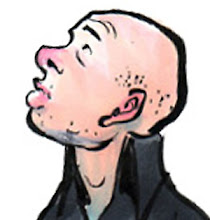
If you look at the main eyeball in today's drawing, you see what a limited bag of tricks I'm working with; I never learned a lot of those professional short cuts like making an eyeball look dripping wet and transparent. This makes my stuff look a little four-square and unsophisticated at times...esp'ly when I'm working in ink, a medium that's (rightly) developed such a sophisticated shorthand for painterly effects (though maybe that tradition is falling away to be replaced by obvious PhotoShop substitutions--think of our eyeball example above and what you'd see done with layers and transparency).
I'm not saying I'm above such "cheap theatrics"--just that I never learned enough of 'em!
I do remember being 13 or so and reading an article on the automotive design program at Art Center (in Pasadena). All kinds of super-slick, car-o-the-future illustrations--and all done by students--accompanied the article (this was in the final days of old-school illustration: Prismacolors and a real airbrush--another implement I never learned to use). And while the work was impressive (and doubtless done by the exact folks who became the leading lights of arguably the finest generation of automotive designers), the one thing that really stuck with me from that article was a comment from an instructor.
He was critiquing a student's design and said something like, "Stop trying to impress me! You need to communicate with me. All I see here are flashy effects--where's the underlying form? Where's the idea?"
And now, 20-plus years later, I still have no idea what that nutter was talking about....
Am I the only one who thought the Addams Family post from yesterday was sooooo funny?
22 April, 2011
Subscribe to:
Post Comments (Atom)


No comments:
Post a Comment