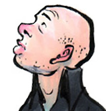
A Conifer of Catalina, submitted as a tribute to the work of Dr. Mike DeWeese, artist of "Brush Pine Breakfast."
Ruined it with quickie attempt at background, which I duly knocked back in PhoSho. The handling of needles are practically textbook "over-sensitive."
31 July, 2011
26 July, 2011
25 July, 2011
24 July, 2011
23 July, 2011
Brush pen vista sketched at the Getty.
Jimmy did pass along his link. For all sorts of Gorham goodness, CLICK HERE.
I don't know if Jimmy's ever been to the Getty, but if he has, I'm sure he liked their poetic recreation of a miner's flue.
And hey, Rick Schmitz was at the TAG Dinner, too! He's got a very nice personal site...and everyday he posts a cartoon on Nearsighted Comics. Chez it out!
22 July, 2011
This year's Annual T.A.G. San Diego ComicCon Dinner took place at City Deli. Lots of laughs and good eats (all flavored vodkas were $5--flustered bartender when I asked for the Nutella Absolut).
You can see our Captain America reax at the World Famous T.A.G. Blog.
Spotted dining (with attendant links):
Scott Benefield (of CORK and Ghost Provokers fame)....
Tom Carrol showed up accompanied by Johnny B. Gerardy and his femme Emily....
Jimmy Gorham is a force of nature... but he's cagey about links. I'm working on him....
Jeff Ranjo was there, but posts exclusively to Facebook now... friend him and feel the fresh air of his great wit and great drawing.
And hey--kick in some coin for Scott's Ghost Provokers project!
This was a chef at Disneyland.
20 July, 2011
19 July, 2011
18 July, 2011
16 July, 2011
14 July, 2011
13 July, 2011
My 70's sportscaster team. I came up with them a few years ago as a "thank you" card motif, but love to re-purpose them. Here they are toasting my cousin Barb and her husband Steve's anniversary.
It's a fold-out on glitter-dust paper!
I'm getting back to work here...been on the road almost all of the last month. Got lots o' drawings to share.
It's a fold-out on glitter-dust paper!
I'm getting back to work here...been on the road almost all of the last month. Got lots o' drawings to share.
04 July, 2011
So remember that iPad painting I did of the mist-enshrouded mountain? I had it printed to canvas by the people at Cafe Press in the hopes of gifting it last Xmas...but the printing didn't look so hot. All the darks in the foreground printed nearly black, and there was very little color/value differentiation in the piece--like they crushed it into a very contrast-y, very muddy painting.
So I asked them to reprint it. Which they did gratis (thank you, Cafe Press).
But it still looked blown-out and muddy.
So I did the only thing a respectable artist could do in such circumstances: I pulled out my brushes. Had to go buy some Turpenoid, and found my palette lacking any yellow except Naples (which, c'mon, is really more like beige), but spent an enjoyable morning on each one and I must say that, however rangy the results, there is satisfaction in the pine trees. Here's the first effort:
These photos exaggerate the palette difference, but it is true I seriously cooled the grassy ski-run on the top (second) effort.
I like this idea of serio-printing images on canvas, then giving them a good "impasto" pass. Might be able to sell them in an Aaron Bros. for a few bucks....
p.s. The iPad original still looks best in digital format.
Subscribe to:
Comments (Atom)


